
This example was done using QGIS 2.16.2 with the German localization. But the method should be very easily transfered to other localizations and version.
First open Qgis and load the data. As S-411 is a vector data set one has to use the load vector data set button or the corresponding menu item.
Choose the GML data in folder data of the exchange set.
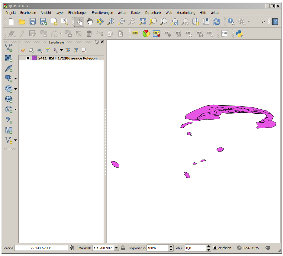
We loaded a Baltic sea ice chart issued by the Bundesamt für Seeschifffahrt und
Hydrographie (BSH). Each polygon is visible, but all polygons have the same colour.
To differentiate the polygons right click on the layer name and open the properties.
In the properties window choose the Style button at the bottom and load a new style (as SLD).
There is one style provided for the sea ice concentration (
seaice_iceact.sld) and another for sea ice thickness/ stage of development
(seaice_icesod.sld). Color of the polygons are then chosen according to the
total concentration, respective the largest thickness.

Here the ice concentration portrayal was chosen, the presentation corresponds to the WMO standard.

For a nicer view a land layer can be included (overlaying the sea ice) and the whole chart ban be zoomed and moved.

More portrayals as SLD and further information can be found at
http://www.bsis-ice.de/S411/